
CASE STUDY • CLIENT WORK
Austen Labarge, LCSW: a therapy brand with zero soft-focus clichés.
A licensed clinical social worker launching a virtual practice in Upstate New York, built for men and professionals who would rather not wade through lavender fields and lotus flowers to find real support.
BRAND DESIGN
WEB DESIGN + SEO
CONTENT + SOCIAL

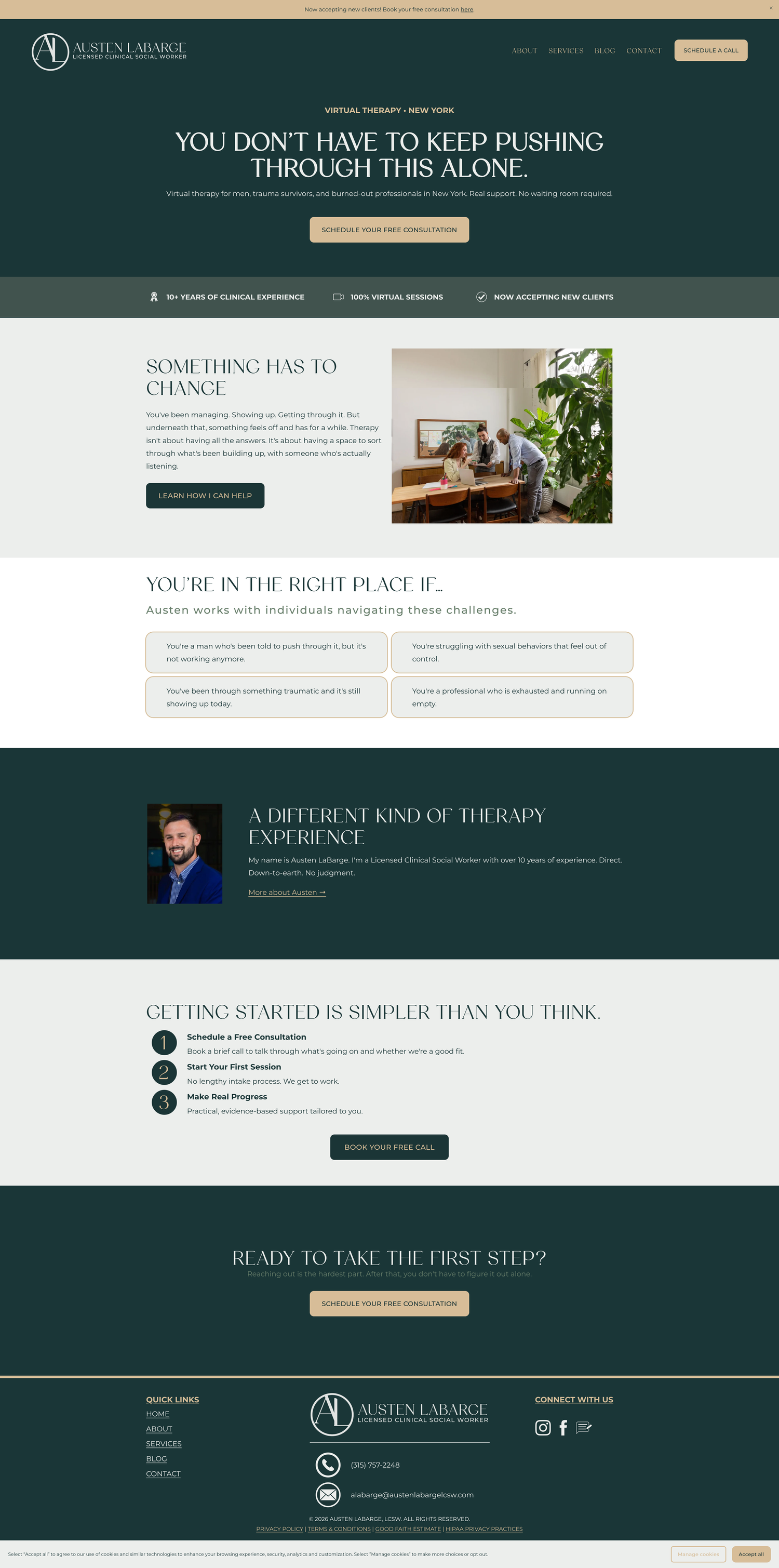
Grounded, direct, and warm without the whisper. His brand, not ours, and that’s the skill.
Austen came to us with a clear problem: the clients he serves best, men and busy professionals, are exactly the people most turned off by how therapy usually markets itself. Soft gradients, vague promises, stock photos of people staring meaningfully at oceans. He needed a brand that sounded like a real conversation.
We built the whole presence from scratch: an earthy, grounded identity, a six-page website that addresses the reader directly, search structure so the right people in the right region actually find him, and a content system so the brand keeps showing up after launch day. Strict copy rules throughout: no wellness fluff, no vague comfort language, direct address only.
Therapy branding usually whispers. This one talks straight.
THE BRAND PALETTE
Five colors, zero pastels

HEARTHSTONE
DEEP TIMBER


MORNING FOG
WORN LEATHER


MOSSY TRAIL
WHAT WE DELIVERED
The full launch stack, start to finish
Brand identity
Logo design with a full file suite: transparent PNGs and SVGs across all five brand color variants, ready for anything.
Brand voice + copy rules
A documented voice that talks straight: direct address, no soft wellness language, warmth without the whisper.
Six-page website
A 70-domain toxic backlink disavow, full site audit cleanup, URL redirects, and six keyword-targeted blog posts.
SEO foundation
Metadata, page structure, and regional keyword targeting so searches for virtual therapy in Upstate NY find him.
Social templates
On-brand, reusable templates so every post looks like the website without a designer on call.
30-day content calendar
A full month of planned content at launch, so the brand showed up online from day one instead of month three.
THE RECEIPTS
Launch day, by the numbers
6
pages designed, written, and built
5
brand color variants in the logo suite
30
days of content planned before launch
0
soft-focus wellness clichés. We counted.
“Tyler and Click Command Co. completely transformed my website and digital footprint. They were extremely easy, thoughtful and detail-oriented in our work together, and have allowed me to feel 100% confident about my marketing and my business!”
Austen LaBarge
Owner + clinician, Austen LaBarge, LCSW

YOUR BRAND COULD BE NEXT
Launching something? Launch in whole.
Brand, website, SEO, and a month of content, all speaking the same language on day one. Tell us what you're building.